

closeup Sales Insight


Table of contents
INTRODUCTION
It's been a few days of scrambling for the team. We had the task of choosing a Product in Nigeria or used by Nigerians and working on a Product Sales Insight using Microsoft Excel and Power BI.
The major challenge we had was finding a good data set. Most Nigerian companies do not have their data conveniently displayed on their websites for easy scraping. We scoured the internet individually looking for data, sites like kaggle, GitHub, data.gov, Gapminder, re3data etc and found a few. Some were scattered across various sites and we would have to scrape and merge the data gotten. We had a session and out of this few, we selected an E-commerce set we got from kaggle, kaggle.com/datasets/babajidedairo/nigerian-.. and finally decided to focus on one particular brand; CloseUp Toothpaste.
Cleaning up this data set was another serious task. It came with a lot of unwanted information, errors and duplications so we had the team split in two. One sub-team on Excel and the other on PowerBI. We had everyone work separately but had frequent meetings and access to one another in the case of questions. This was so everybody could be involved and also to make up for lapses.
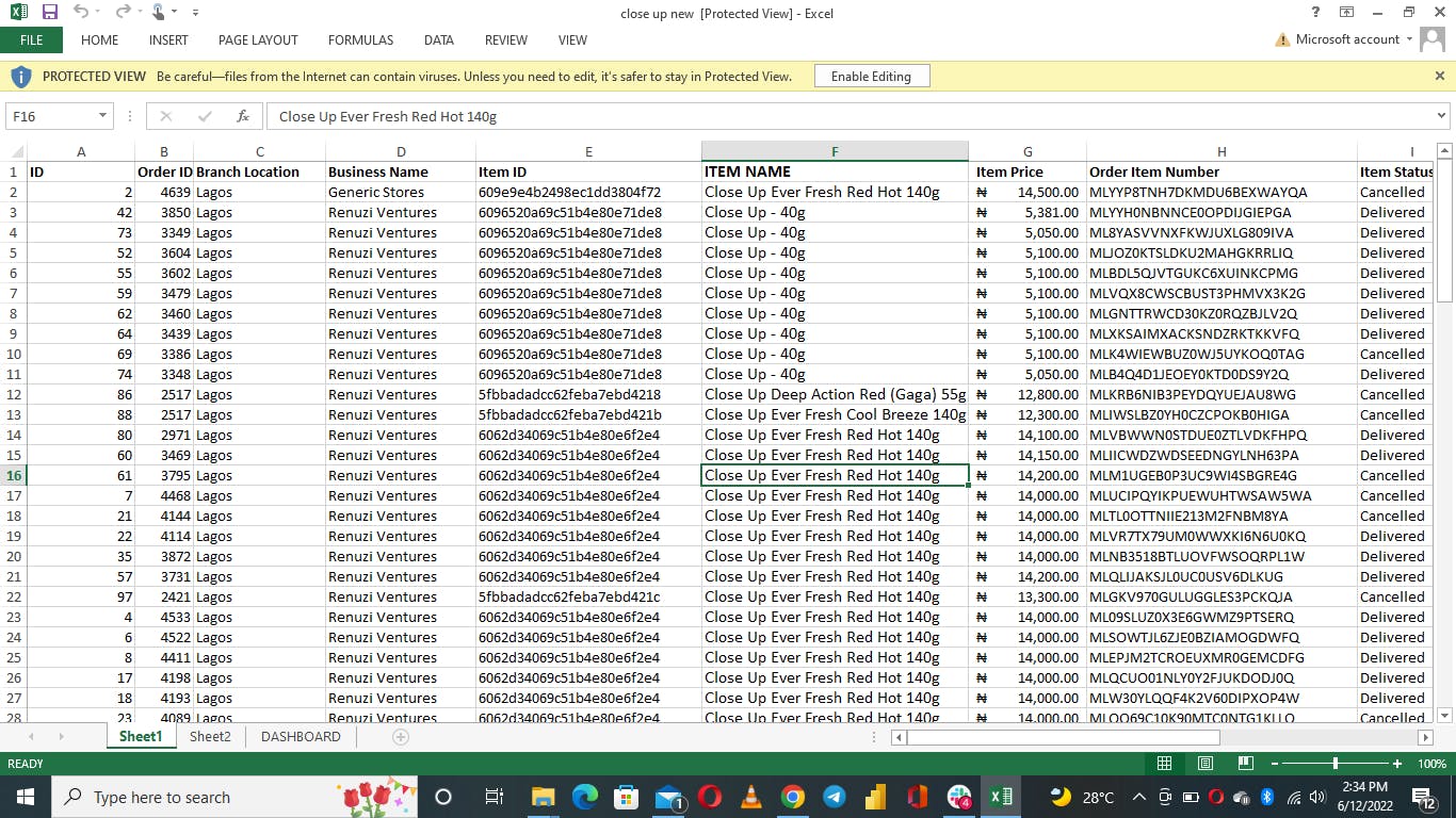
Both teams had the files cleaned up further by removing unwanted columns (took only data with "closeup"), correcting wrong cells and taking out duplicate columns. Looking at the data set, it could be seen that...
- There are two blank cells each under Order Local Area and Region columns. This is most likely because they are for the Invalid Orders.
- The price for Close Up 40g was not uniform and so were the item IDs
- Close Up Ever Fresh Red Hot 140g appears multiple times in the data with different prices and Item IDs. For 2 and 3,apparently, instead of a fixed price, there's a range of price the company sells at. Also, the different Item IDs could be as a result of change in item identification style or incoming batches of separate products having different IDs for identification.
USING EXCEL
The excel team sorted some of the important columns alphabetically then went ahead to analyse the data using pivot tables. We were able to come up with about 4 pivot tables. These tables where filtered based on the information we wanted to get out of the data.
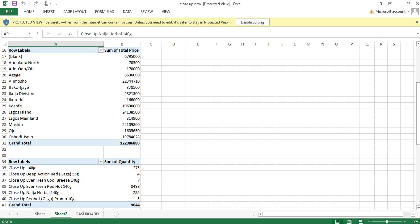
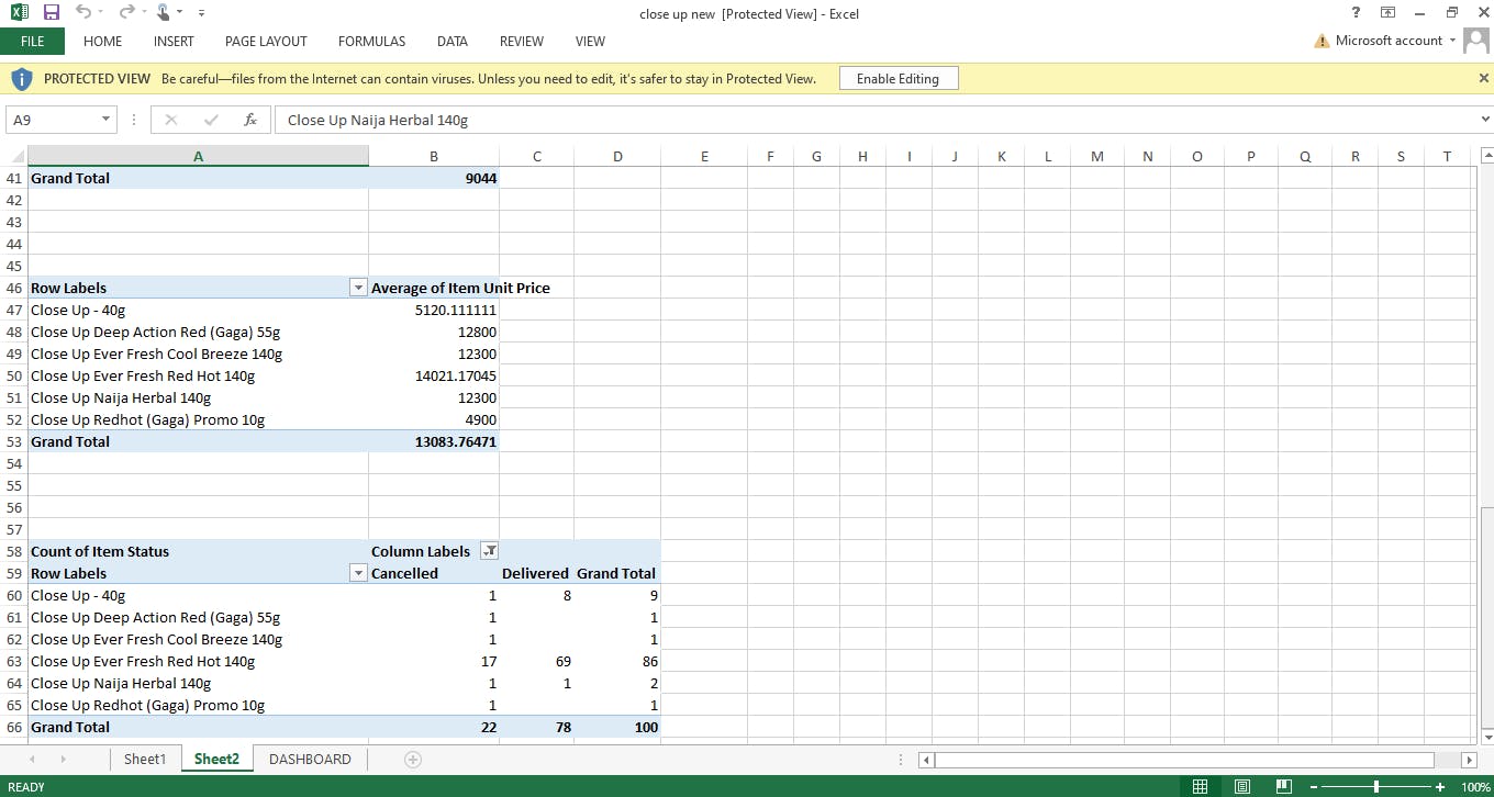
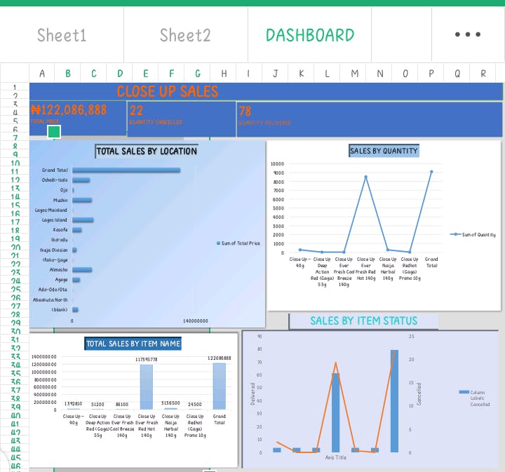
Finally, we went on to create the dashboard. This was a little bit tasking because there are limited chart styles to use on Excel. It was also a very fun experience, we could and did play around with colors a lot and finally decided to go with some cool shades of blue. There are 4 charts on the dashboard; Sales by Item name, Sales by Location, Sales by Item Status, Sales by Quantity.
USING POWER BI
After importing the data into PowerBI, transforming it was not too bad as we had already extracted the Product data we wanted on excel. We removed the duplicate columns, made text corrections by using the "Replace Text..." option. For the two empty cells each on the Region and Order LGA columns, we put "Invalid" in the empty cells as these were for Invalid orders.
NOTE: We had to do this on Excel because PowerBI does not allow replacement of texts for cells only. It will replace that text anywhere it appears on that whole column instead. After Transforming the data, we closed and applied and went on to visualization. We used stacked column Chart, Stacked Bar Chart, Pie Chart, Donut Chart, Line Chart and Matrix to build the Dashboard. We also used slicers to make it interactive. Below is the dashboard we came up with...
closeup Sales Insight

ANALYSIS
We tried as much as possible to answer the following questions without overloading the dashboards...
- Sales by location
- Close up name with highest sale
- Close up name with lowest sale
- Percentage delivered, cancelled and invalid orders.
- Products with sale of highest/Lowest quantities
- Months with Highest/Lowest sales
From the dashboard, it was quite clear that Close Up Ever Fresh Red Hot 140g was the highest in terms of sales and quantity sold, while closeup Deep Action Red(GAGA) 55g was the lowest in quantity, and closeup Red Hot(Gaga) Promo 10g was the lowest in sales. This could be as a result of the close range of prices but rather large difference in sizes(Ever Fresh has a price range of 13000 to 15000 and Deep Action 12000 to 13000. Red Hot(GAGa) could be as a result of its size).
Very little order came from Ogun State compared to Lagos and further actions are to be taken to generate more sales from there.
Lagos Island made the highest order while Lagos Mainland made the lowest. Why?
The percentage of invalid and cancelled orders were very low compared to delivered orders. Work can be done to reduce this even further.
It can also be seen that the overall highest sales in 3 months were made in March, the least by a large margin made in April. What caused this? What can be done to correct this?
In conclusion, a lot of research is to be made by the Renuzi Ventures to find out the whys of the result and how to answer them in order to generate more sales.